Oh boy, this is a big one. The portfolio charts have been completely overhauled, complete with a new look, new chart types, "privacy" mode and a huge level of customization.
New look
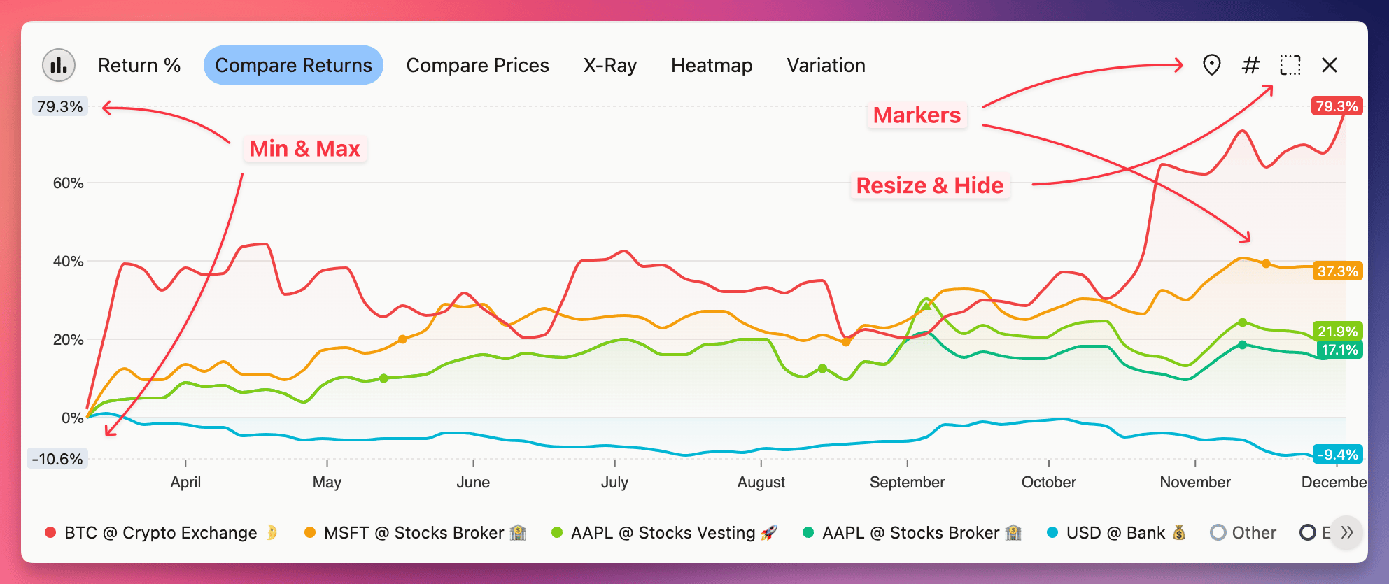
Charts use a new color palette, that is way more discernible, but still easy on the eyes. All visual aspects like spacing, hover effects, transparency and tooltips where highly optimized to find the balance between looks and functionality.
You can also choose one of the three sizes, or hide the chart altogether. On the left axis, you will always see the min & max labels, and you can always toggle the transaction markers, which are now drawn directly on the line series. Plus if you hover the marker, you will see the icons for transaction types that occurred within the hovered period.
And finally, there's a legend under the chart, where you can quickly highlight the series and toggle them. With a double-click, you will hide all series except the one you clicked. 🦉
New chart types
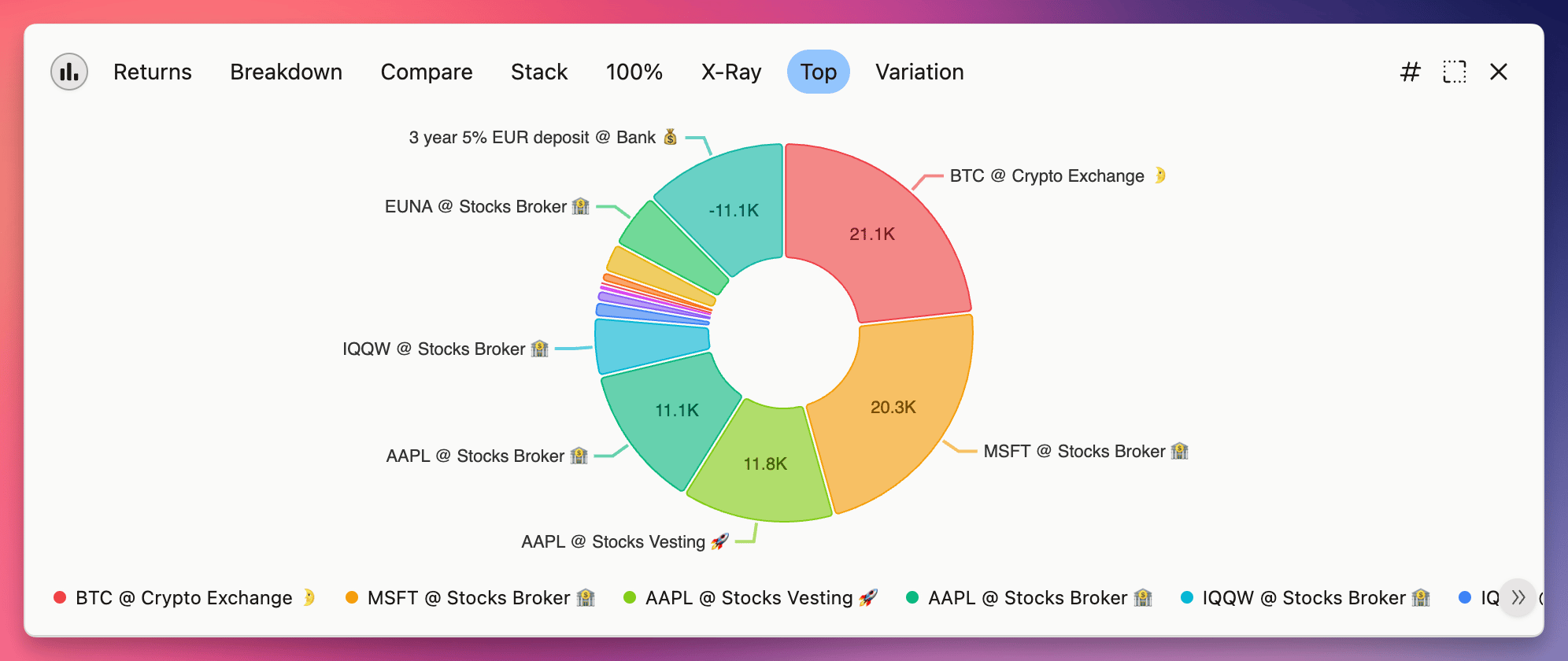
I think the venerable Donut doesn't need any introduction...
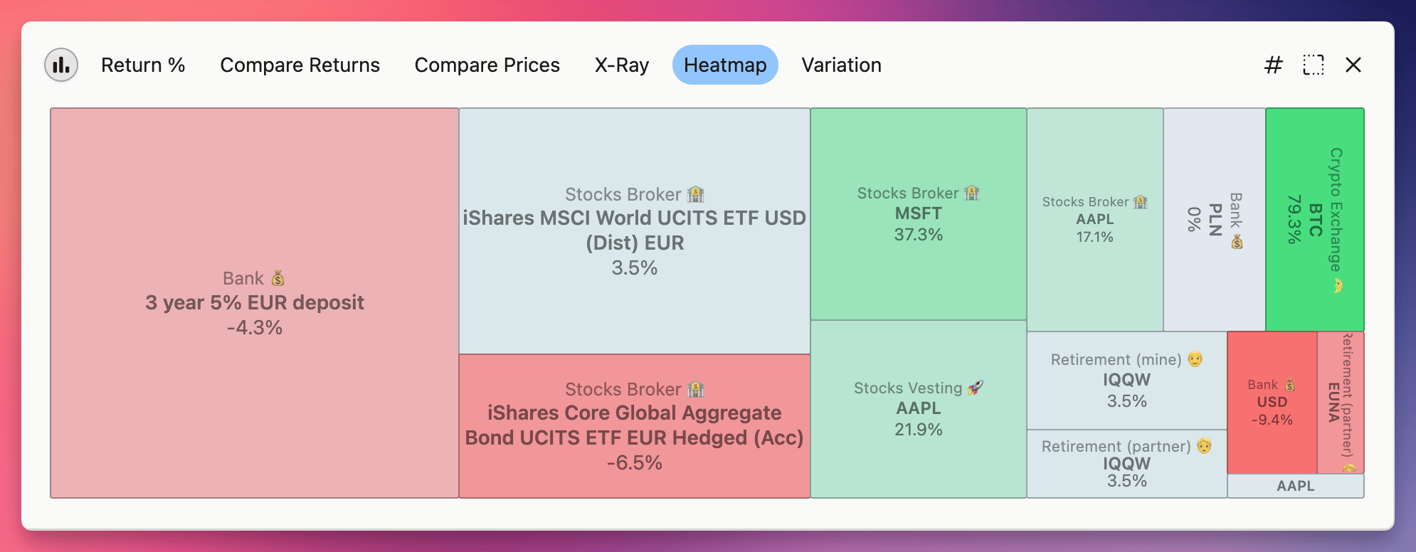
 Heatmap uses colors to tell you how different parts of your portfolio performed. The size of the rectangles is based on a new metric - Average Invested Principal - so even if position is closed, you can still see it here.
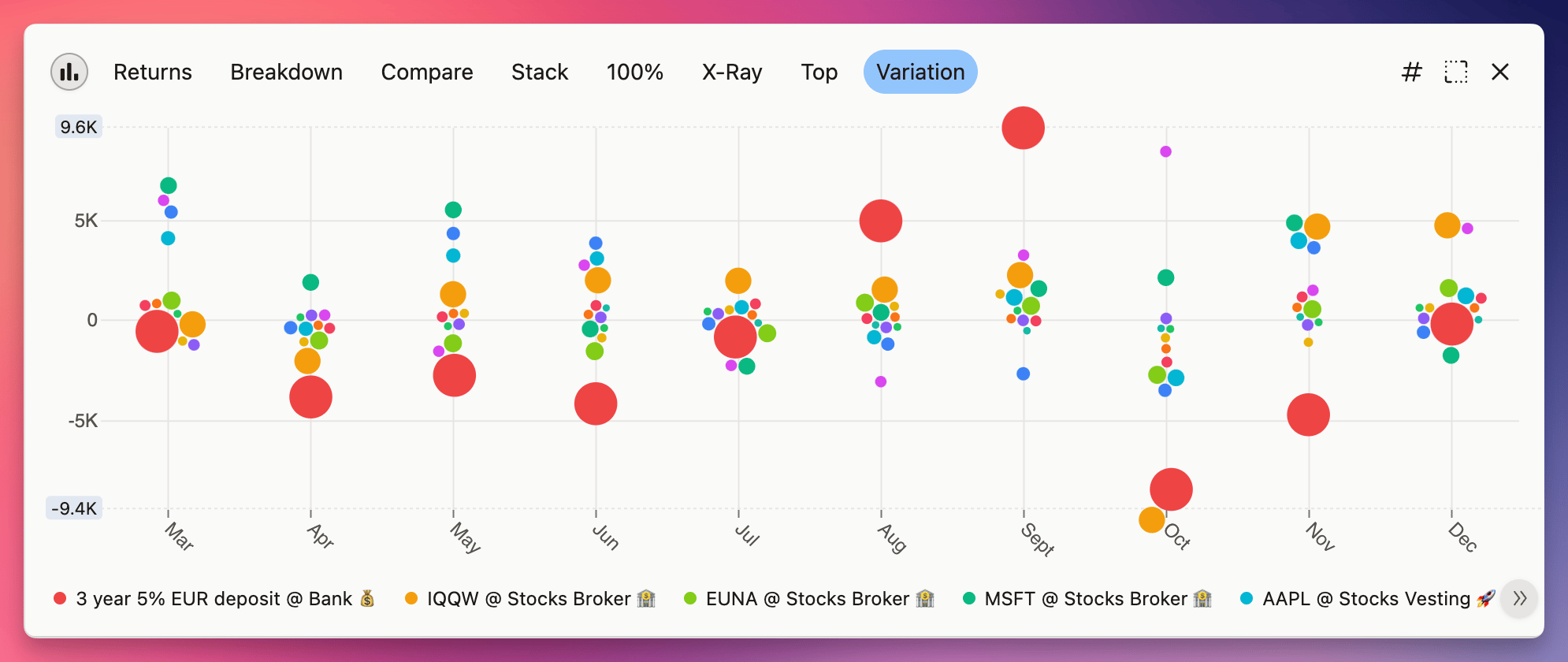
 Variation (or Swarm) shows how much of variability is in your portfolio and where it comes from. The bigger the circle, the bigger the Average Invested Principal - so big circles that are far from 0 will have a large impact on your returns.
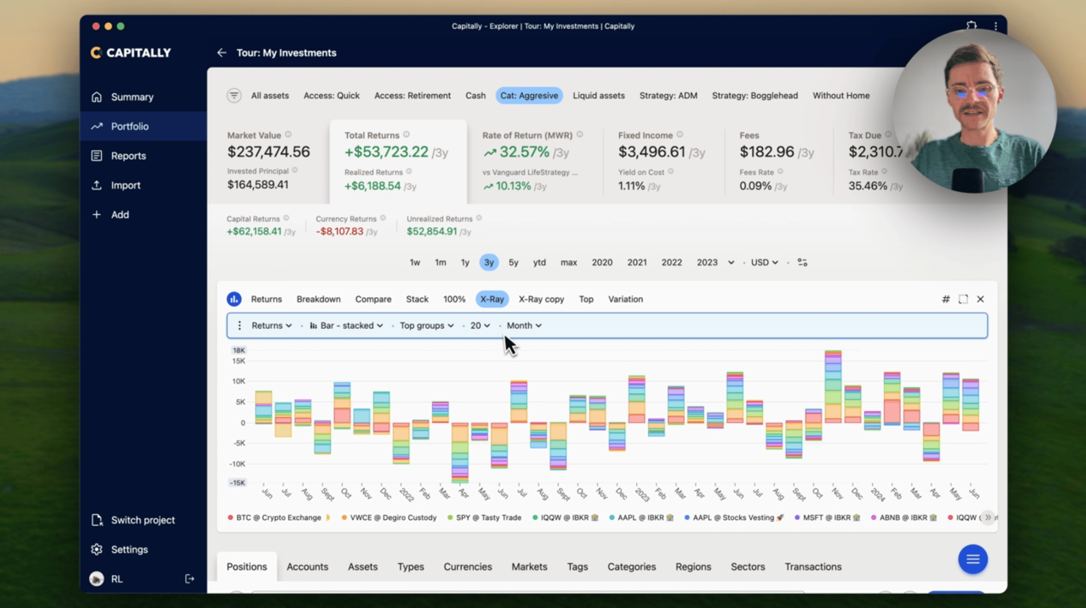
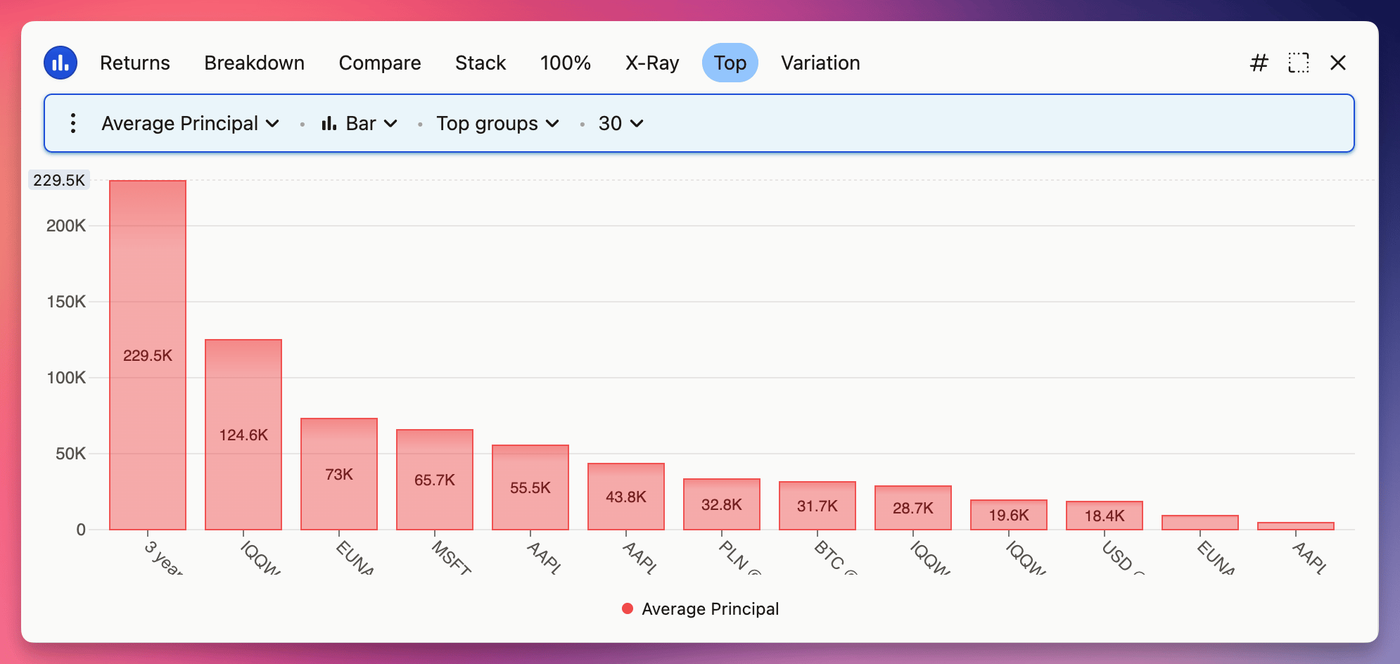
 And you can edit any of the charts by clicking on the chart button. There's plenty of options to discover, plus one "hidden" type of chart - a typical Bar chart, but displaying groups instead of dates as bars.
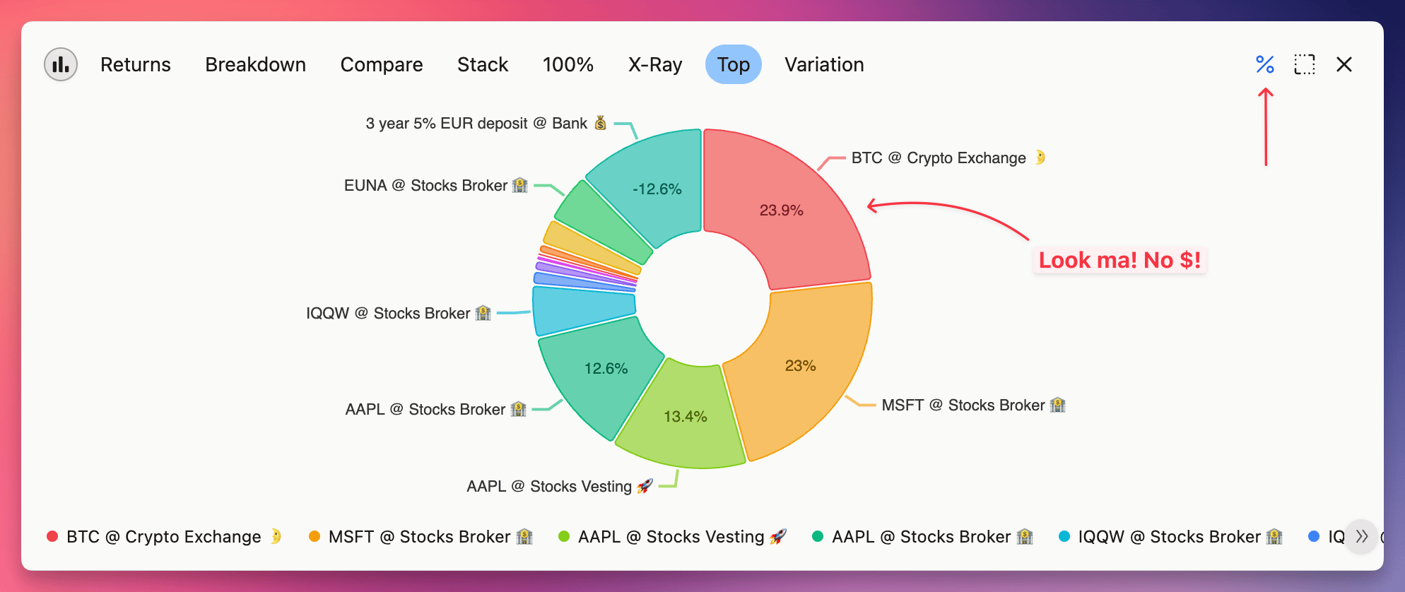
"Privacy" mode for perfect screenshots
Ever wanted to share with somebody your portfolio composition without giving them too much details? Well, now you can toggle any chart from numbers # to percents %. Just remember, that tooltips still display all the details. Also, it can be quite helpful to quickly compare values with each other, and works on all types of charts.
Make your own chart (or change existing one)
And finally, similarly to how Filters work, you can save any changes to the built-in charts, create new ones or delete them. All changes will be synchronized between devices and you can undo them whenever you make a mistake.