Last release added risk metrics as columns and charts. This one puts them together into a report that answers one question: how risky is my portfolio, and why?
A risk score out of 100
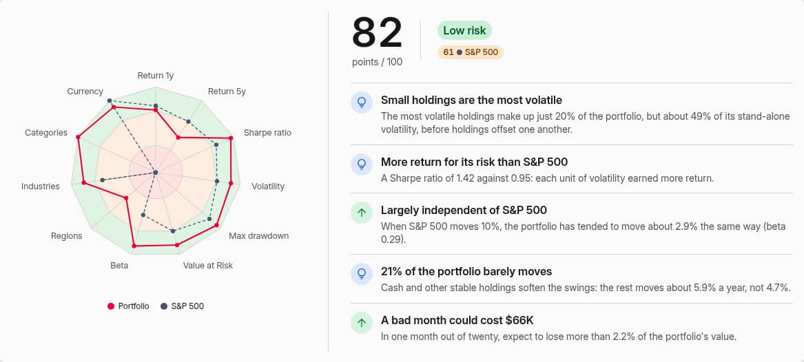
Reports → Risk scores your portfolio from 0 to 100 on eleven measurements: return over one year and the long term, Sharpe ratio, volatility, max drawdown, Value at Risk, beta, and concentration across regions, industries, categories and currencies. Your benchmark gets a score too, so you see straight away whether you run calmer or rougher than the index.
Next to the score, up to five findings say what drives it in plain language.
Every measurement on its own scale
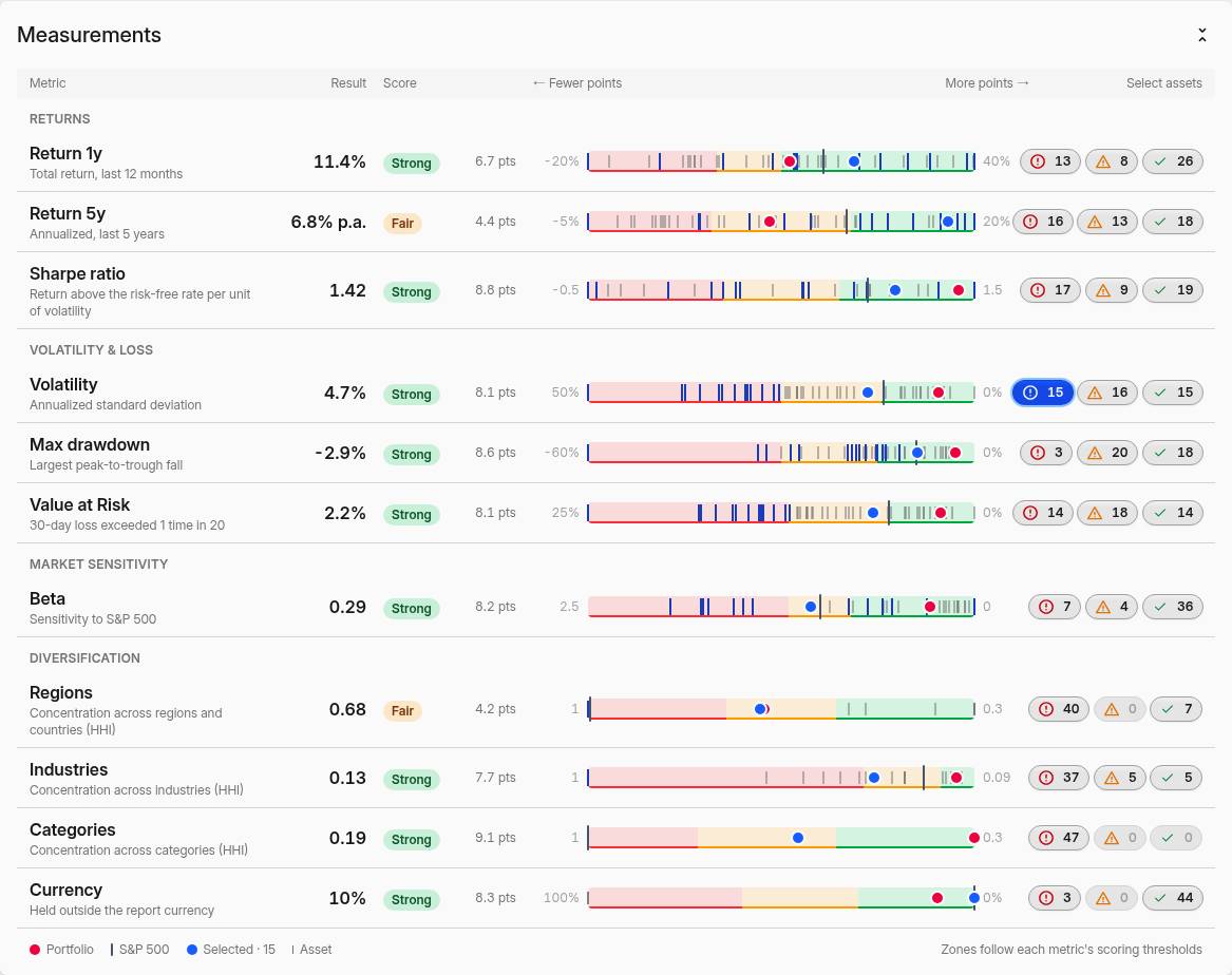
Each measurement is rated Weak, Fair or Strong against its own thresholds, and a bar places your portfolio, your benchmarks and every asset on the same scale. Click the weak count on any row to select those assets: a blue dot will tell you whether the holdings that make the portfolio volatile are also the ones behind its drawdown.
Diversification and risk vs. return
Donuts break the portfolio down by region, industry sector and category with their concentration. A scatter plots every asset's return against its volatility, deepest drawdown or beta, with the portfolio and benchmarks for reference. The assets table below has presets for risk, returns, drawdowns, correlation and diversification, and exports in one click.
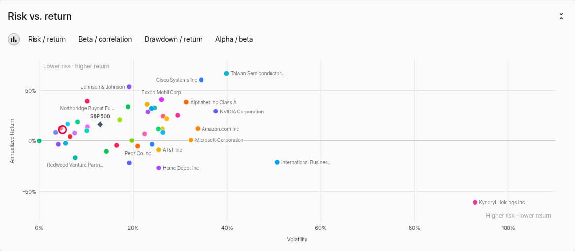 Annualized return against volatility for every asset
What you own now, or what you actually held
By default the report measures today's holdings over the whole period — the risk of what you own now. Switch on Historical allocation to measure what your portfolio actually went through, buys and sells included. Pick 1, 5, 10, 30 or 50 years, one or more benchmarks, and any filter, then save the setup as a bookmark.
See Risk Report for how each measurement is scored.
Also in this release
- Scatter charts in Portfolio. Plot one risk metric against another for every group — return against volatility, alpha against beta — from the chart editor.
- Heatmaps sized by any metric. A new Size picker sets what the rectangles measure: average principal as before, or value, max principal and other metrics.
- More risk metrics for charts: Beta, Alpha, Return and Annualized Return, each with a (Prices) variant, plus Asset Concentration and Currency Exposure.
- Regional diversification now spreads a holding assigned to a broad region, such as Developed, across the regions under it.