The Risk Report scores your portfolio from 0 to 100 on eleven measurements — returns, Sharpe ratio, volatility, drawdown, Value at Risk, beta, and how the money is spread across regions, industries, categories and currencies — and compares that score with your benchmark. It then explains the result in up to five plain-language findings and shows which holdings pull it down. Open it from Reports → Risk.
Reading the risk score
The score adds up points from every measurement: more points mean lower risk or a stronger return. 70 and above reads Low risk, 45 to 69 Moderate risk, and below 45 High risk. Each benchmark you compare against gets its own score, shown in a badge next to yours, so you can see at a glance whether your portfolio is calmer or rougher than the index.
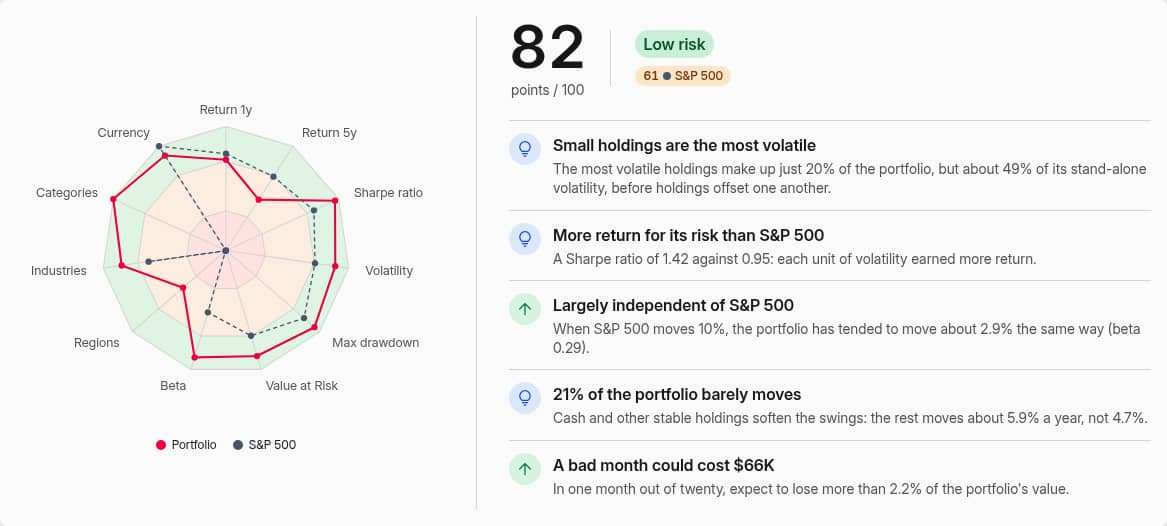 A score of 82 against 61 for the S&P 500, with the radar and the five findings
The radar draws one axis per measurement. The inner, middle and outer rings are the weak, fair and strong zones, so a point on the outer ring is a measurement that scored well. Your portfolio is the solid line and each benchmark a dashed one.
A measurement that cannot be taken is left out rather than counted as zero. Without a benchmark there is no beta; without enough price history there is no long-term return. The remaining measurements are rescaled so that the maximum is still 100.
Findings
Next to the score, up to five findings explain what drives it, picked by how much each says about this portfolio. An upward arrow marks something that raises the score, a downward arrow something that lowers it, and a light bulb an insight that doesn't score directly. They cover drawdowns and how long they took to recover, rare but deep falls, what a bad month could cost in money, stable holdings that damp the swings, small holdings that carry most of the risk, concentration in a few positions, currency exposure, how closely you follow the benchmark, whether the volatility was paid for, and whether the last year ran ahead of or behind the long-term pace.
How each measurement is scored
Every measurement has its own scale. Below the weak threshold it earns up to 4 of its 12.5 points, between weak and strong up to 9, and above strong up to the full 12.5, rising smoothly within each zone. The Measurements section shows the result, its rating, the points and a bar with the three zones. Your portfolio is the red dot, each benchmark a dark line and every asset a small tick, so you can see which holdings sit in the red.
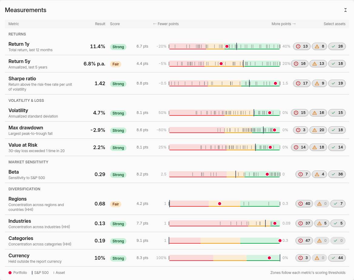 Each measurement with its rating, points and a scale placing the portfolio, the benchmark and every asset
Measurement | What it reads | Weak | Strong |
|---|---|---|---|
Return 1y | Total return over the last 12 months | below 0% | from 10% |
Return 5y | Annualized return over the report period, and over 5 years on the 1-year period; the label follows the period | below 3% p.a. | from 12% p.a. |
Sharpe ratio | Return above the risk-free rate per unit of volatility | below 0.2 | from 0.8 |
Volatility | Annualized standard deviation of returns | above 25% | up to 12% |
Max drawdown | Largest peak-to-trough fall in the period | beyond −30% | within −15% |
Value at Risk | 30-day loss exceeded 1 time in 20 | above 12% | up to 5.5% |
Beta | Sensitivity to the first benchmark | above 1.2 | up to 0.8 |
Regions | Concentration across regions and countries (HHI) | above 0.75 | up to 0.55 |
Industries | Concentration across industries (HHI) | above 0.35 | up to 0.17 |
Categories | Concentration across categories (HHI) | above 0.8 | up to 0.55 |
Currency | Share held outside the report currency | above 60% | up to 30% |
Volatility, drawdown, Value at Risk and the Sharpe ratio are the same figures as the Portfolio columns, calculated the same way — see Risk metrics for the method and the risk-free rate.
The diversification thresholds are anchored on the market. A market-cap weighted world index spread by country reads about 0.53, the S&P 500 about 0.16 across its 11 sectors, and a 60/40 stock and bond mix about 0.52 across categories — each just inside the strong zone. Beta rewards independence: a portfolio that moves one-for-one with the index scores fair, and one that follows it only loosely scores strong.
Finding the holdings behind a weak score
The three buttons at the end of each row count the assets rated weak, fair and strong on that measurement. Click one to select those assets; they appear as a blue Selected series on the radar, on every scale and on the risk vs. return chart. You can also tick assets in the table at the bottom. Selecting the 15 assets that are weak on volatility, for example, shows at once whether they are also the ones dragging down return and drawdown.
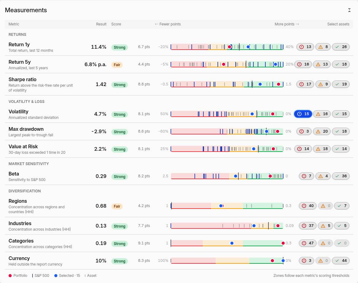 The assets rated weak on volatility, selected and drawn in blue on every scale
Today's holdings or historical allocation
By default the report measures what you own today, as if you had held that exact mix for the whole period. It answers "how risky is my portfolio now", and a position you bought last month is judged on its full price history, not on the few weeks you've held it.
Switch on Historical allocation to measure what your portfolio actually went through instead: the time-weighted history of the holdings you had on each day, including what you bought and sold. Diversification then weighs each holding by its average market value over the period, so a holding you sold halfway through counts about half. The assets table gains a Held column with the share of the period you held each asset. The two modes match the (Prices) and plain risk metric columns.
Holdings with a shorter price history
When some of today's holdings have prices for only part of the period — a recent listing, a new fund, a currency rate that starts later — an alert says how many and what share of the portfolio they make. Until their prices start, they count as unchanged, which makes the portfolio look calmer than it was. Turn Include them off to leave them out: the score, the findings and every chart then measure the rest. In the assets table they are marked with a clock icon and fade out when left out. The alert appears only when Historical allocation is off.
Diversification
The Diversification section breaks the portfolio down by region, industry sector and category, each with its concentration (the Herfindahl-Hirschman Index, the sum of each group's squared share) and its rating. Regions, sectors and categories come from each asset's taxonomies. A holding assigned to a broad region such as Developed is spread across the regions directly under it, and industries are rolled up to their top-level sector.
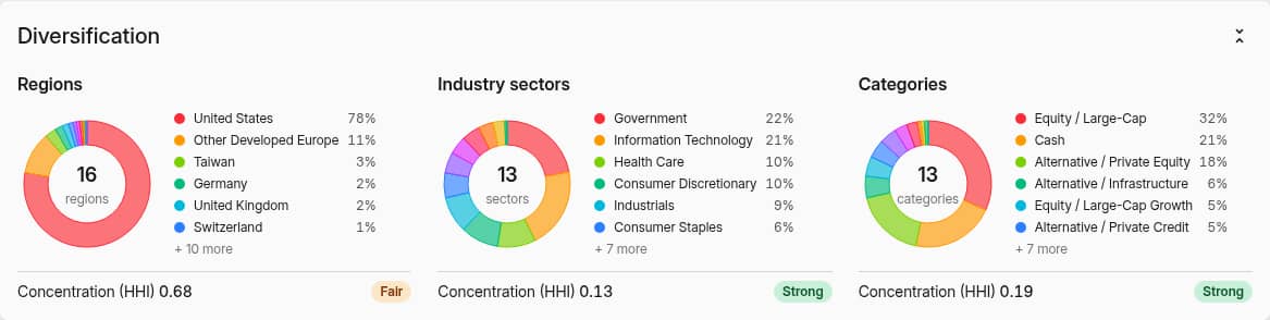 Regions, industry sectors and categories, each with its concentration
Value with no region, sector or category assigned counts as one group of its own. A portfolio heavy in property, private funds or other unclassified assets therefore reads as concentrated until you assign them.
Risk vs. return
The scatter plots every asset as a point, with your portfolio and each benchmark as reference points. Risk / return sets annualized return against volatility: the top-left corner is lower risk and higher return, the bottom-right the opposite. Drawdown / return does the same with the deepest drawdown, Beta / correlation shows how each asset relates to the benchmark, and Alpha / beta separates return earned independently of the market from exposure to it.
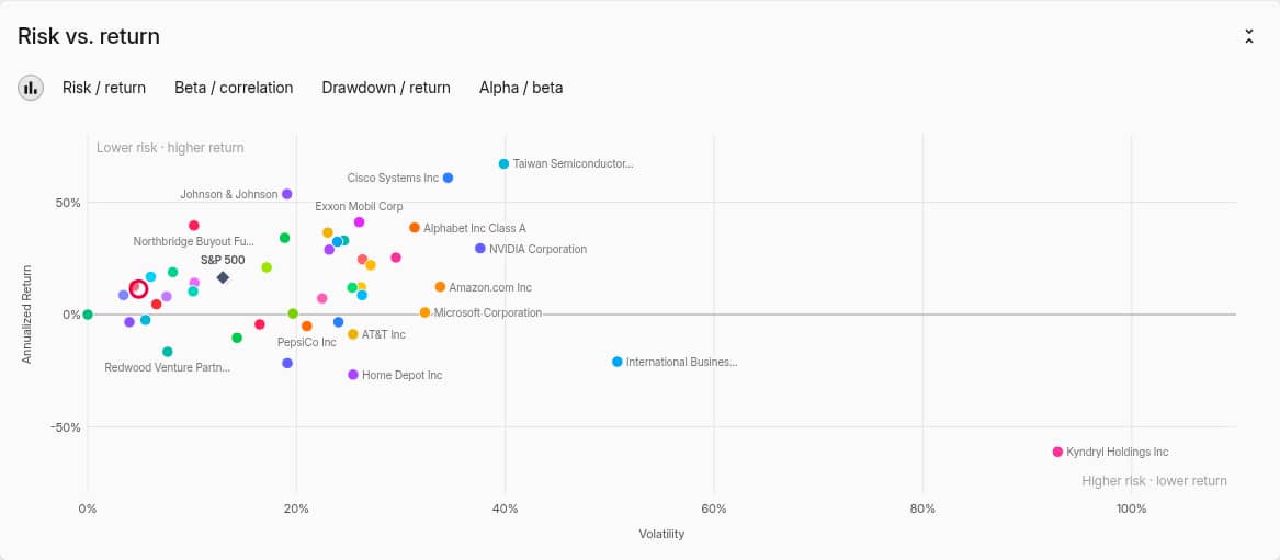 Annualized return against volatility for every asset, with the portfolio and the S&P 500
The same Scatter chart type is available when you edit a chart in Portfolio.
The assets table
The table lists every asset with its weight and measurements, with your portfolio and benchmarks pinned at the bottom. Presets switch between Risk, Returns, Drawdowns, Correlation (one column per benchmark) and Diversification; changing any column switches to Custom. Export downloads the table.
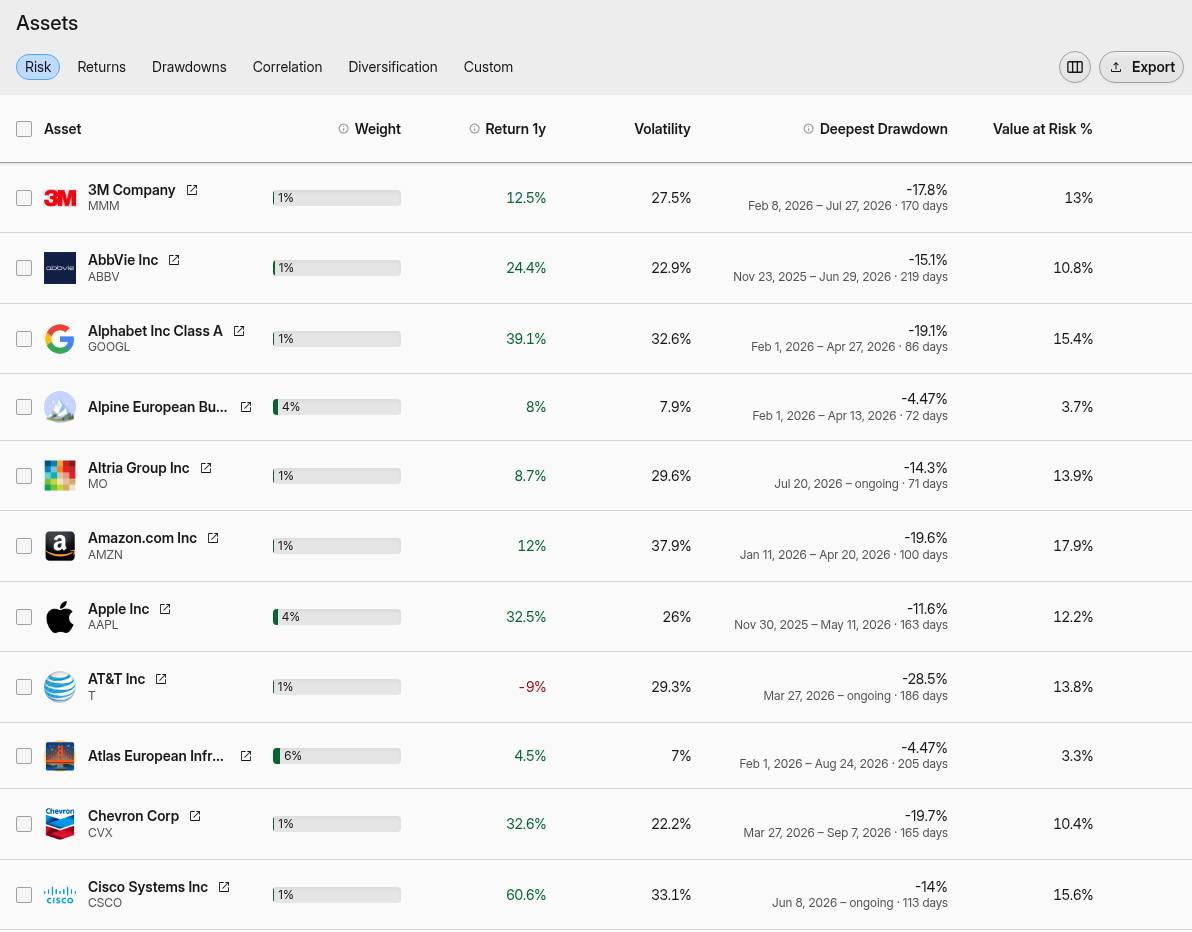 The assets table with the Risk preset
Period, benchmark and filters
- Period — 1, 5, 10, 30 or 50 years. The long-term return is annualized over the period.
- Compared to — one or more benchmarks. The first one is the reference for beta, correlation and the findings. A benchmark built from an account, a filter or your own holdings is measured on what it holds, including its diversification.
- Filter — the filter presets above the controls score only part of the portfolio, such as your ETFs or one account.
- Returns options — whether fees, taxes and income count towards the returns. The report always uses time-weighted returns, so deposits and withdrawals never read as gains or losses.
Save the setup as a bookmark to reopen it in one click; you can choose which parts it keeps — filter, benchmark, period, currency, historical allocation, returns options, collapsed sections, chart and table columns.
A score, not a verdict
The score measures how your portfolio behaved against fixed thresholds; it doesn't know your goals or horizon. A young investor's all-equity portfolio can rightly score Moderate, and a portfolio that is mostly cash can score Low risk while losing to inflation. Read the measurements behind the number.